Beyond Pass/Fail: Using Exam Analytics to Improve Teaching and Curriculum Design
Posted On 29 May 2026
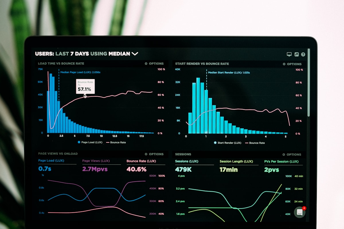
For most of the history of formal education, the data an instructor took away from an exam was a single number per student. The class average might have been added at the bottom, a histogram drawn on the chalkboard for dramatic effect, and that was that. The next semester began, the same lectures were delivered in roughly the same order, and any signal hiding in last term's results was lost. Modern online exam platforms quietly changed this, and the change is bigger than most institutions have yet noticed. Every click, every response, every revisited question on a digital exam produces structured data — and that data, properly interrogated, can answer questions that pass/fail grading was never designed to answer: which concepts didn't land, which questions are quietly broken, which students are coasting, and which lecture is the actual bottleneck in a curriculum.
The shift from grading to measurement
Grading and measurement are different activities that are often confused with one another. Grading produces a number for the registrar. Measurement produces evidence about what students know and what they don't. A well-designed online exam, paired with even basic analytics, generates measurement data as a side effect of grading — but only if the educator stops treating the gradebook as the endpoint. The first habit shift, and arguably the most important, is to stop asking "what is the average?" and start asking "where, exactly, are the gaps?" The answers are almost never where intuition expects them to be.
A test that produces only a score teaches you about your students. A test that produces analytics teaches you about your teaching.
Five reports every educator should be reading
Most exam platforms expose more analytics than instructors use. The reports that pay back the time spent reading them are these. The item difficulty report tells you the proportion of students who got each question right; anything above 0.9 is probably too easy and anything below 0.3 is probably too hard or poorly worded. The discrimination index measures whether top scorers and bottom scorers responded differently to a given item — a low or negative number is a red flag that something about the question is misleading even the strongest students. The objective-mastery report aggregates results by learning outcome rather than by student, telling you which goals the cohort met and which they didn't. The distractor analysis for multiple-choice items shows which wrong answers were chosen most often, exposing specific misconceptions. The time-on-question report reveals which items students lingered on and which they raced through, often a cleaner signal of confusion than the right/wrong column alone.
What the data tends to reveal — and why it's uncomfortable
The first time a department looks at item-level analytics in earnest, three patterns almost always emerge. First, a handful of questions everyone assumed were "easy reviews" turn out to have surprisingly low success rates, exposing topics that the lectures glossed over. Second, a handful of questions everyone assumed were rigorous turn out to have such poor discrimination that they are essentially coin flips — the question is testing something other than what it intended to test. Third, one or two lectures or chapters reliably underperform across multiple exams, semester after semester, regardless of which instructor delivered them. That last pattern is the most uncomfortable, because it is curricular rather than personal: the material itself, or its placement in the sequence, is the bottleneck. Pretending the data didn't surface it is the most expensive thing an institution can do.
From single exam to longitudinal view
One exam is a snapshot. Many exams, viewed together, form a longitudinal view that no single instructor can hold in memory. A platform that tracks performance across an entire course or program can answer questions like: do students who struggle with topic A in week three also struggle disproportionately with topic G in week eleven? If yes, A is likely a prerequisite for G in a way the syllabus does not currently acknowledge. Are students from a particular feeder course consistently weaker on quantitative items? If yes, the upstream course has a calibration problem worth a conversation. Did this semester's cohort outperform last semester's, controlling for incoming GPA? If yes, whatever you changed deserves credit; if no, whatever you changed deserves a closer look. These are the kinds of questions that move a department from anecdote to evidence.
Closing the loop: from insight to action
Analytics that nobody acts on are an expensive way to feel modern. The institutions that get real value out of exam data tend to share a few habits. They build a short, recurring rhythm — often a thirty-minute "post-exam huddle" within forty-eight hours of an assessment closing — where the instructor team scans the reports together and writes down two or three concrete adjustments before the meeting ends. They keep a shared "items to retire or revise" list so weak questions don't quietly resurface next term. They schedule an annual curriculum review meeting that explicitly uses end-of-term analytics as input, not just student evaluations and gut feel. And they make sure adjuncts and new faculty have access to the same dashboards as senior faculty, because the people who most need the signal are often the ones least likely to seek it out.
A worked example: the chapter nobody could explain
Consider a real-shape pattern that turns up often in introductory statistics courses. The topic of "conditional probability" frequently shows an objective-mastery score five to ten points below the rest of the course, year after year, regardless of who teaches it. The natural first response is to assume the students are lazy or unprepared. The data tells a different story when you dig in: the distractor analysis shows that the most common wrong answer is the one that confuses P(A|B) with P(B|A), and the time-on-question report shows that students who eventually answered correctly spent three to four times longer than the section average. That is not a "students didn't study" pattern — it is a "the formal notation is overwhelming the underlying intuition" pattern. The intervention is not more homework; it is a fifteen-minute reframing of the same concept using a tree diagram in week six. After one term of that change, the mastery score for the topic rises by twelve points and the time-on-question normalizes. None of this would have been visible from the gradebook alone.
Equity, fairness, and what analytics can't tell you
Exam analytics are powerful, but they are not neutral. A discrimination index will happily flag an item as "well-discriminating" without telling you whether the discrimination is along lines of prior preparation, language, or background that a fair exam should not be measuring. Use the data to surface questions, not to issue verdicts. When a particular item or section consistently underperforms for a particular subgroup of students, the appropriate response is to investigate the item, not the students. The most common culprits are unfamiliar contexts in word problems, idiomatic English in stems, and unstated cultural assumptions in distractors. Catching these takes a human review of the items the analytics flag, not blind acceptance of the numbers.
Practical tools that pay back quickly
You do not need a data-science team to extract value from exam analytics. The high-leverage actions are mostly low-tech. Tag every item with its learning objective before the exam launches, so the objective-mastery report has something to aggregate. Set a calendar reminder to spend fifteen minutes on the analytics within a week of every major assessment. Keep a running document with two columns: "items to revise" and "instructional changes to try next time." Rotate the responsibility for the post-exam review across the teaching team so no single person becomes the bottleneck. Once these habits are in place, the more sophisticated analyses — longitudinal cohort tracking, predictive at-risk identification, automated item-quality flags — become useful enhancements rather than overwhelming starting points.
Talking to students about their own data
One of the easiest wins from richer analytics is also one of the most overlooked: showing students what the data says about their own learning. A score of 78 is opaque; a breakdown that says "you mastered objectives one through four but missed roughly half of the items tied to objective five" is actionable. Students who see objective-level feedback after every assessment learn to study with intent rather than by rereading the textbook in a panic the night before. They start to ask better questions in office hours, and their study groups stop being about copying notes and start being about closing specific gaps. The platform is doing some of the metacognitive work that most students were never explicitly taught to do for themselves, and the downstream effect on engagement is real.
A quieter revolution than it sounds
Headlines about education technology tend to focus on flashier stories: AI tutors, adaptive courseware, virtual reality classrooms. The quieter revolution — the one that has the best evidence base behind it — is simply this: when educators routinely look at what their assessments are telling them, teaching gets better. Curricula get tighter. Bad questions stop recycling. Good questions get reused with confidence. Students at the margins get identified before the final exam, not after. None of this requires a fundamental change to what an instructor already does. It requires a shift in what counts as "finishing" an exam: not the moment the last student clicks submit, but the moment the report has been read, the items have been audited, and the next syllabus has been quietly improved.